Wow, how the time flew by! I am so happy to have had the opportunity to take this course as it has provided me with new skills and understanding in multimedia that I will certainly apply in the workforce. The Adobe program was something that I had never used before and I was a little nervous and intimidated to start. But with the guidance of our instructor and the tutorials at hand, I dove right in and created various media contents using Photoshop, Illustrator, Audition and Premiere.
I have chosen to revise my Video Story that I created on Adobe Premiere. I did not have any experience with creating videos prior to this course and have often been interested in learning how to do so. I’ve always wanted to integrate videos in my current work practice as videos are a great way to attract and engage your audience.
Working for a non-profit trade association, I know that solid membership marketing is required to acquire, engage, and retain members. The main purpose of the video story can be found on my previous blog post.
I realized that the addition of captions to my video story may be a great way to increase accessibility allowing people with hearing disabilities access to the content. It will also improve user experience, giving my audience the ability to enjoy the content, regardless of the environment they are in.
Using the caption tool on Adobe Premiere, I was able to create captions that coincide with the narration in the video. I created a new caption file and opted for open captions as I wanted the captions to be visible throughout the video. In the caption panel, I was able to add and format the text accordingly. I made sure that the in and out points matched up with the narration.
Since my target audience are new members of the association such as: builders, renovators, developers (essentially anyone in the residential construction industry), a lot of our members work in the field of construction which often means that they are surrounded by loud noises. By providing captions in the video it allows them to view the content in any environment they may be in.
I think that this video would certainly serve its purpose by being embedded in the association’s website or “Members only” page as a valuable member resource. It would also be beneficial to include the link on the welcome email that is typically sent to new members of an association.
For my video story, I decided to create a welcome video targeted towards new members of the MHBA (association).
Background on the MHBA:
The Manitoba Home Builders’ Association is a non-profit trade association providing members and the general public information about the housing industry in the Province of Manitoba. The association is comprised of companies such as home builders, land developers, renovators, manufacturers, suppliers amongst other companies who contribute to the housing industry.
Purpose of the Video Story:
The purpose of the video story is to welcome new members to the association and advise them of their membership benefits. This video can be embedded or attached to a welcome email that the association sends to new members. The video details member benefits such as receiving the latest industry information, networking opportunities and education and training opportunities. The end of the video encourages the new member to attend upcoming networking events, as well as to reach out to association representatives if they have any questions or would like to learn more about their benefits. For the purposes of this assignment, I have used a made-up web address and phone number.
Recording and Editing Process:
For this video, I decided to be a little bit more creative and make an animated video as opposed to a real-life recording. With the current situation surrounding COVID-19, I am currently under strict quarantine and cannot capture real-life videos outside of my home for the project. I thought about just recording myself in my home, but I figured that the images would not nearly be as effective or interesting to the viewer. Creating animations for my video would allow me to be as creative as I want and create different locations as I required for my video.
Before the animation process, I first drafted the voiceover script for my video. The script was then recorded on my Phone’s Voice Memo App. After recording my voiceover script, I then started to envision the shots that would coincide with the voiceover and created a shot list.
After the finalizing my script and identifying the shots I needed, it was then time to create my animated scenes. I currently subscribe to a program called “Animaker” and was able to create my animated shots through there. While creating my animations, I ensured to follow video best practices such as the 3×3 method and 10 second rule, in addition to the rule of thirds in order to capture a well composed shot. You will see that I also used my own personal photographs of a golf tournament and gala event along with the animations. After creating my shots in Animaker, I uploaded the recordings on to Adobe Premiere to do the rest of my editing.
Before starting the editing process, I created a video storyboard in order to get organized with all the content I’ve produced. My storyboard can be found HERE.
I first started editing the voiceover recording and ensured that the script was within the allowable timeframe of the project. Using the razor tool, I edited out any “uhms” and “ahs” for a cleaner voiceover. I also ensured that I spaced out the narration appropriately so that it sounded like one cohesive conversation. I also used the audio editing tool to reduce my volume to 4.1 Db as the original recording was a tad bit too loud for my liking. After editing the audio for my video, it was then time to edit the animated shots. Using the “mark in” and “mark out” tools, I was able to choose my scenes and cut them to the appropriate length in order to piece together the shots as per my storyboard. Lastly, I needed to find a background music to set the tone of my video. Using a creative commons site, Freesound.org, I was able to find an upbeat loop called “Free Music Background Loop 001” by Skaling_97. Since the music was not long enough in length, I placed the songs back-to-back for a continuous loop until the end of my video. I reduced the volume to -25.6 Db so that the music did not interrupt the voiceover of the video. For the intro, I used the audio transitions tool > Crossfade > constant power at the beginning of the music so that it gradually become louder for the intro. I also placed a video effect > dissolve > cross dissolve at the very beginning of the scene. At the end of the video, I placed the same effects, this time to fade the music out and to fade to black to end the video.
Peer Review of the Draft:
I received some great feedback from my group on how to better enhance the quality of my video. Below were some suggestions I received…
One feedback received was the addition of new scene clips in the video. Such as the creation of an animated golf scene and gala event, as opposed to still images of the actual event. I will think about this option, as I feel that by including actual photographs in the video, it brings a sense of reality for the viewer. I do feel that I need an additional scene of “members mingling” in animated form, so I will create it and add it to the video.
Another comment I received was pertaining to the mouth movements in my animations. I will continue to work on timing of the mouth movements or perhaps look at the option of not including mouth movements in some scenes if it looks too distracting.
Final Version:
I created a new “members mingling” animated scene and added that to the members event portion prior to the real-life photograph stills in the video. I decided that by keeping the photographs in the video, it brings a sense of reality for the viewer. Another revision that I did was tighten up the text effects to the narration. I simply timed it better so that it coincided with the voice-over in order to not be a distraction to the viewer. One of the comments received from my group was the mouth movements in the animations. I tried my best to ensure that the movements went along with the voice-over as well. For the parts that did not work so well, I decided to opt out of the mouth movements for those scenes. Lastly, at the end of the video, I flipped the cellphone scene with the “contact us” scene so that the contact us scene was at the end and had more screen time for the viewer to take in the information.
I think that overall, the final version was a success! Having a welcome member video is a great way to engage with new members in any association, and turning it into an animation is a fun and creative way to relay your message to your target audience.
For my video story, I decided to create a welcome video targeted towards new members of the MHBA (association).
Background on the MHBA:
The Manitoba Home Builders’ Association is a non-profit trade association providing members and the general public information about the housing industry in the Province of Manitoba. The association is comprised of companies such as home builders, land developers, renovators, manufacturers, suppliers amongst other companies who contribute to the housing industry.
Purpose of the Video Story:
The purpose of the video story is to welcome new members to the association and advise them of their membership benefits. The video details member benefits such as receiving the latest industry information, networking opportunities and education and training opportunities. The end of the video encourages the new member to attend upcoming networking events, as well as to reach out to association representatives if they have any questions or would like to learn more about their benefits. For the purposes of this assignment, I have used a made-up web address and phone number.
Recording and Editing Process:
For this video, I decided to be a little bit more creative and make an animated video as opposed to a real-life recording. With the current situation surrounding COVID-19, I am currently under strict quarantine and cannot capture real-life videos outside of my home for the project. I thought about just recording myself in my home, but I figured that the images would not nearly be as effective or interesting to the viewer. Creating animations for my video would allow me to be as creative as I want and create different locations as I required for my video.
Before the animation process, I first drafted the voiceover script for my video. The script was then recorded on my Phone’s Voice Memo App. After recording my voiceover script, I then started to envision the shots that would coincide with the voiceover and created a shot list.
After the finalizing my script and identifying the shots I needed, it was then time to create my animated scenes. I currently subscribe to a program called “Animaker” and was able to create my animated shots through there. While creating my animations, I ensured to follow video best practices such as the 3×3 method and 10 second rule, in addition to the rule of thirds in order to capture a well composed shot. You will see that I also used my own personal photographs of a golf tournament and gala event along with the animations. After creating my shots in Animaker, I uploaded the recordings on to Adobe Premiere to do the rest of my editing.
Before starting the editing process, I created a video storyboard in order to get organized with all the content I’ve produced. My storyboard can be found HERE.
I first started editing the voiceover recording and ensured that the script was within the allowable timeframe of the project. Using the razor tool, I edited out any “uhms” and “ahs” for a cleaner voiceover. I also used the audio editing tool to reduce my volume to 4.1 Db as the original recording was a tad bit too loud for my liking. After editing the audio for my video, it was then time to edit the animated shots. Using the “mark in” and “mark out” tools, I was able to choose my scenes and cut them to the appropriate length in order to piece together the shots as per my storyboard. Lastly, I needed to find a background music to set the tone of my video. Using a creative commons site, Freesound.org, I was able to find an upbeat loop called “Free Music Background Loop 001” by Skaling_97. Since the music was not long enough in length, I placed the songs back-to-back for a continuous loop until the end of my video. I reduced the volume to -25.6 Db so that the music did not interrupt the voiceover of the video. For the intro, I used the audio transitions tool > Crossfade > constant power at the beginning of the music so that it gradually become louder for the intro. I also placed a video effect > dissolve > cross dissolve at the very beginning of the scene. At the end of the video, I placed the same effects, this time to fade the music out and to fade to black to end the video.
There you have it, my first take on creating a welcome video using Adobe Premiere! EJNOY!
Audio Story Final – MHBA Promotional Audio Story: “Why Hire an MHBA Builder?”
For my audio story, I decided to create a promotional clip in which outlines the benefits of hiring an MHBA Builder member when building a brand-new home.
Background on the MHBA:
The Manitoba Home Builders’ Association is a non-profit trade association providing members and the general public information about the housing industry in the Province of Manitoba. The association is comprised of companies such as home builders, land developers, renovators, manufacturers, suppliers amongst other companies who contribute to the housing industry.
Not all home builders in the Province of Manitoba are required to be a member of the association, therefore the association strives to educate the public to put their trust in companies who are members. When hiring an MHBA builder, the customer gains the benefit of hiring a reputable company. All MHBA builders are mandated by the association to have a safety program in place, in addition to carrying a third-party warranty provider to give homeowners peach of mind.
Purpose of the Audio Story:
The purpose of the audio story is to highlight the benefits of hiring an MHBA Builder member. The target audience of this promotional audio piece are families who are seeking to build a brand-new home. The audio details the benefits of hiring an MHBA member such as Safety and Warranty, and in the end has a call to action encouraging listeners to visit the association’s website for more information. For the purposes of this assignment, I have used a made-up web address.
Recording and Editing Process:
I used my iPhone’s Voice Memo recorder to record the audio. Then by using Adobe Audition, I was able to cut out the relevant audio pieces by using the “Razor Select Tool”. After I found the audio clips that I intended to use, I placed them on a separate track. I then looked for the appropriate background music using FreeSound.org – a creative commons audio website. I decided to use “Funky Upbeat Loop” by ispeakwaves as I wanted something upbeat to set the tone of the promotional piece. I placed this audio clip on the track below. Since the music audio is only a 32 second clip, I had to loop it repeatedly for the duration of my audio story.
My promotional clip starts out with the music fading in and the audio at +4.5 dB. Before the informative audio begins, the music slowly decreases to -11.4 dB while the informative audio is at +7.5 dB. Near the end of the informative audio, the music clip gradually gets louder from -11.4 dB, to +5.3 dB, then back to -11.4 dB just before the second informative clip starts. I repeat this process throughout the audio story. You will notice that after each informative clip, the music will get louder, then get softer just before the next informative clip begins. I did this in order to break up the dialogue and provide a natural ‘start’ and ‘stop’.
Peer Review of the Draft:
My peers gave me some great insight on how to better improve my audio story. Below were the suggestions I received…
Getting rid of the ‘ums’ – I received a comment from a group member advising that I should clean up the soundbites some more by deleting the ‘ums’ and ‘ahs’ in the clips. I did try my best to do so when doing the draft but will indeed work on cleaning up the clips some more for the final draft.
Using another music clip – I received another comment from a group member suggesting that I should use more than one music clip and create segments with no music and some natural sound. I plan to find some “construction” sounds and use those as part of my audio piece. Perhaps placing them before the soundbites.
Revised Version:
Sticking to the suggestions I got from my peers, I started with trying to look for ambient sounds such as sounds that you hear on a construction site. I checked out Freesound.org and found the right clip called “Construction 1.wav” bysortan. I cut the sounds using the razor select tool and placed them to go along with the interview soundbite. I lowered the volume to -14.9 db so that it does not overpower the interview clips. Next, I cleaned up my interview clips by removing any “ums” and “ahs” using the razor select tool.
In the end, by adding the ambient sound to the interview clip, it gave it a more natural sound/feel as if the person was being interviewed at an actual construction site. It also gave listeners some type of context, that the conversation is likely related to construction.
In the end, I felt that the small additions and deletions to my initial draft vastly improved the overall quality of the promotional audio clip.
Audio Story Draft – MHBA Promotional Audio Story: “Why Hire an MHBA Builder?”
For my audio story, I decided to create a promotional clip in which outlines the benefits of hiring an MHBA Builder member when building a brand-new home.
Background on the MHBA:
The Manitoba Home Builders’ Association is a non-profit trade association providing members and the general public information about the housing industry in the Province of Manitoba. The association is comprised of companies such as home builders, land developers, renovators, manufacturers, suppliers amongst other companies who contribute to the housing industry.
Not all home builders in the Province of Manitoba are required to be a member of the association, therefore the association strives to educate the public to put their trust in companies who are members. When hiring an MHBA builder, the customer gains the benefit of hiring a reputable company. All MHBA builders are mandated by the association to have a safety program in place, in addition to carrying a third-party warranty provider to give homeowners peach of mind.
Purpose of the Audio Story:
The purpose of the audio story is to highlight the benefits of hiring an MHBA Builder member. The target audience of this promotional audio piece are families who are seeking to build a brand-new home. The audio details the benefits of hiring an MHBA member such as Safety and Warranty, and in the end has a call to action encouraging listeners to visit the association’s website for more information. For the purposes of this assignment, I have used a made up web address.
Recording and Editing Process:
I used my iPhone’s Voice Memo recorder to record the audio. Then by using Adobe Audition, I was able to cut out the relevant audio pieces by using the “Razor Select Tool”. After I found the audio clips that I intended to use, I placed them on a separate track. I then looked for the appropriate background music using FreeSound.org – a creative commons audio website. I decided to use “Funky Upbeat Loop” by ispeakwaves as I wanted something upbeat to set the tone of the promotional piece. I placed this audio clip on the track below. Since the music audio is only a 32 second clip, I had to loop it repeatedly for the duration of my audio story.
My promotional clip starts out with the music fading in and the audio at +4.5 dB. Before the informative audio begins, the music slowly decreases to -11.4 dB while the informative audio is at +7.5 dB. Near the end of the informative audio, the music clip gradually gets louder from -11.4 dB, to +5.3 dB, then back to -11.4 dB just before the second informative clip starts. I repeat this process throughout the audio story. You will notice that after each informative clip, the music will get louder, then get softer just before the next informative clip begins. I did this in order to break up the dialogue and provide a natural ‘start’ and ‘stop’.
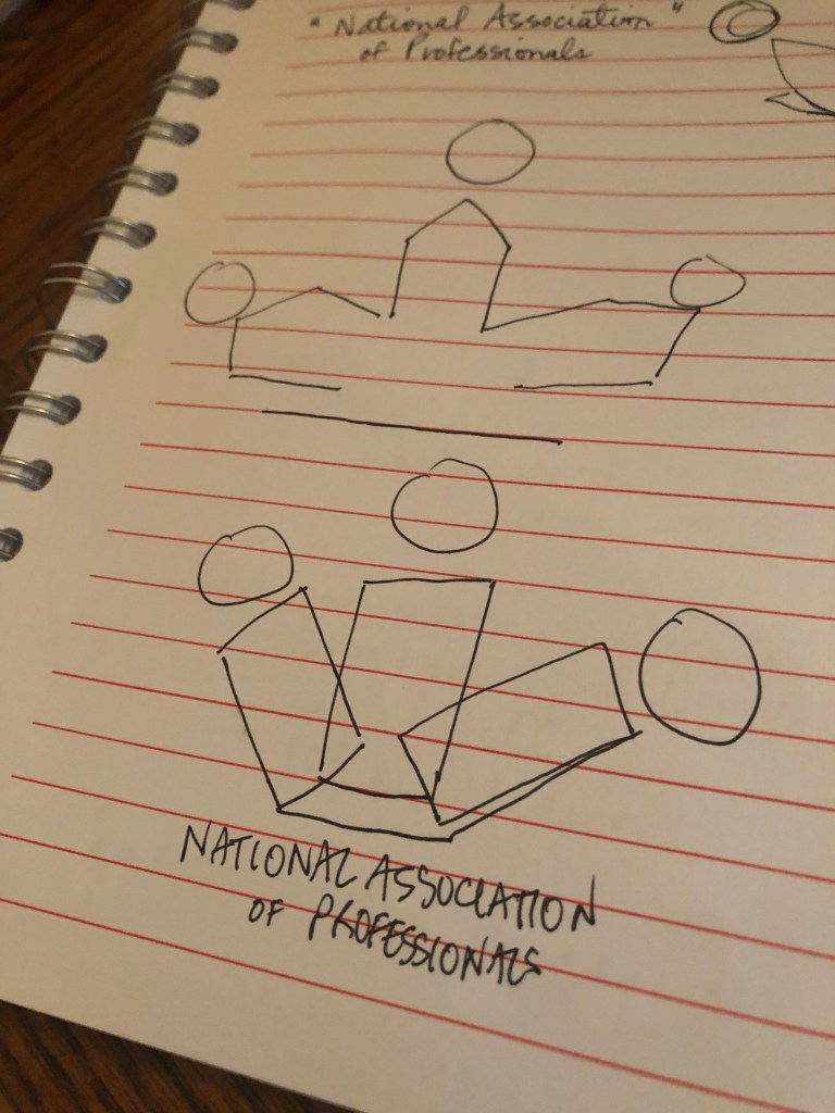
In keeping with my theme for this course, I wanted to create a logo design for an association. My mock association is the “National Members Association”.
A general search of “association logos” showed me that most association logos are designed with simplicity in mind. They are typically comprised of an image, the association’s name and about 2-3 color combinations. This gave me a general idea of what I should include in my logo design.
While brainstorming what my design should be comprised of, I wrote down what I thought would be essential aspects in a logo.
First, I wanted the main image of my logo to symbolize a group of people or “members” which I believe are the backbone of an association. You can read more about their importance in my past blog post here.
I wanted the overall logo design to be simple (not fussy or too abstract).
I wanted the logo to look sleek and professional – again an important part of creating the overall image of an association.
Initial sketches of my logo
The Design Process
I first started with an 800 x 800 pixels artboard. I then created a white background using the rectangle tool. This background was then locked in place.
My next step was to create the main image on my logo. I used the rectangle tool and created one long lean rectangle. I then used the curvature tool to bend it into a shape that I desired – a half crescent shape. I then created a circle using the circle tool and placed it above the half-crescent to look like a shape that resembled a person. I grouped the two shapes and created a mirrored copy to place on the other side. Next, in order to create the middle shape of the image, I copied the two mirrored shapes, layered them slightly above one another, then used the shape builder too to turn it into one new shape. I placed this new shape behind, but in between the two original mirrored shapes. Then I placed a circle above it. I kept the stroke for the shapes at 1 pt. This new group of shapes now resembled a group of individuals – which is intended to symbolize members of an association.
I grouped each of the “person” shape so that I can give them their own individual colors. The colors I have chosen are dark blue (0071bc), royal blue (336699), and teal (339999). I chose these color combinations as I wanted an aesthetic combination that appeased to most audiences and exerted professionalism. For the circles, I used radial gradient at a 0-degree angle. For the body (half crescents) I used a radial gradient as well, with a 0-degree angle and 100% aspect ratio. For the middle body, I used a radial gradient at a 0-degree angle and a 400% aspect ratio.
Next, was to create the text for the logo. Using the type tool, I created the top text “National” in Copperplate Gothic Bold, size 84. I then placed a rectangle behind this text to act as a banner. I grouped the text and banner together and by using Arc at 0 degrees, created the top banner. The bottom banner “Members Association” was created using the same text, with size 43.55. Both the top and bottom banner color was a darker blue shade (1e5e82). I placed this banner at the bottom of the image. Lastly, using the type tool, I added the “est. 1950” as I saw during my research that many associations like to add the date in which they were established in order to build trust and credibility with the audience.
First Draft – Association Logo
Peer Feedback:
The feedback I received from my peers mainly pertained to the font size of my text and its placement.
I agree with the comments I received from my group that the font could use a bit of work. I figured that the main logo image had a modern feel, but the text looked too traditional, so I changed the font to a sans serif for a more modern look. I also increased the size of the text so that it won’t get distorted on different print sizes.
I also played around with the placement of the text. I was not 100% certain of the initial placement with the “national” at the top and “members association” at the bottom, so instead, I placed all the text in one banner underneath the image.
Second Draft – Association Logo
New Logo (FINAL VERSION)
After revising my initial logo design based on the feedback received, I still wasn’t satisfied. The only look I was please with, was the main silhouette image I created. I took a step back and started from scratch. Below are the steps I took to create my final logo design.
I first started with an 800 x 800 pixels artboard. I then created a white background using the rectangle tool. This background was then locked in place.
Using the grid and ruler, I placed a line at 400 to find the center.
I used the Ellipse tool to create the outer circle (holding down shift to ensure evenness).
I created 3 circles at different strokes (outermost circle = 3 pt., middle = 13 pt., inner = 12 pt.)
I then created crescent shapes using the rectangle and curvature tool, the shape was mirrored and then layered on top of each other to create a human form. By using the shape builder tool, I was able to create new shape that resembled a human silhouette.
The left and right silhouettes were created by making another crescent shape via rectangle and curvature tool. I then mirrored this shape and place them both in front of the human shaped image. The strokes of all the silhouettes are 3 pt.
I then used the shape builder tool to trim the shapes that overlapped the smallest circle for a cleaner effect. It made it look like the silhouettes were inside the circle.
I created small banners for the “est. 1950” text. I used curvature tool to create the preferred shape then mirrored and placed on the other side.
For the “National Members” part, I created a circle using the ellipse tool, then using the “type on a path tool”, I was able to set my text along the circular line. I placed “Association” at the bottom.
I stuck with the blue hues as my logo’s color. Blues are often associated with trust, security and reliability which is what an association should be known for. The chosen colors are below.
004f7f – colour of outer circles
003e5e – middle silhouette and letters
0071bc – right silhouette and left circle
339999 – left silhouette and right circle
And there you have it! My final logo design… I feel that this new logo design embodies a trusted association. The new design is sleek and professional, yet simple and straightforward. It isn’t too clustered, and it is not too abstract. The letters are easy to read, and this logo design can be shrunk down and blown up without distorting the elements. I am finally satisfied with the final look.
Final Design – Association Logo
Below you will see the progression of my logo design.
In keeping with my theme for this course, I wanted to create a logo design for an association. My mock association is the “National Members Association”.
A general search of “association logos” showed me that most association logos are designed with simplicity in mind. They are typically comprised of an image, the association’s name and about 2-3 color combinations. This gave me a general idea of what I should include in my logo design.
While brainstorming what my design should be comprised of, I wrote down what I thought would be essential aspects in a logo.
First, I wanted the main image of my logo to symbolize a group of people or “members” which I believe are the backbone of an association. You can read more about their importance in my past blog post here.
I wanted the overall logo design to be simple (not fussy or too abstract).
I wanted the logo to look sleek and professional – again an important part of creating the overall image of an association.
My initial sketches
The Design Process
I first started with an 800 x 800 pixels artboard. I then created a white background using the rectangle tool. This background was then locked in place.
My next step was to create the main image on my logo. I used the rectangle tool and created one long lean rectangle. I then used the curvature tool to bend it into a shape that I desired – a half crescent shape. I then created a circle using the circle tool and placed it above the half-crescent to look like a shape that resembled a person. I grouped the two shapes and created a mirrored copy to place on the other side. Next, in order to create the middle shape of the image, I copied the two mirrored shapes, layered them slightly above one another, then used the shape builder too to turn it into one new shape. I placed this new shape behind, but in between the two original mirrored shapes. Then I placed a circle above it. I kept the stroke for the shapes at 1 pt. This new group of shapes now resembled a group of individuals – which is intended to symbolize members of an association.
I grouped each of the “person” shape so that I can give them their own individual colors. The colors I have chosen are dark blue (0071bc), royal blue (336699), and teal (339999). I chose these color combinations as I wanted an aesthetic combination that appeased to most audiences and exerted professionalism. For the circles, I used radial gradient at a 0-degree angle. For the body (half crescents) I used a radial gradient as well, with a 0-degree angle and 100% aspect ratio. For the middle body, I used a radial gradient at a 0-degree angle and a 400% aspect ratio.
Next, was to create the text for the logo. Using the type tool, I created the top text “National” in Copperplate Gothic Bold, size 84. I then placed a rectangle behind this text to act as a banner. I grouped the text and banner together and by using Arc at 0 degrees, created the top banner. The bottom banner “Members Association” was created using the same text, with size 43.55. Both the top and bottom banner color was a darker blue shade (1e5e82). I placed this banner at the bottom of the image.
Lastly, using the type tool, I added the “est. 1950” as I saw during my research that many associations like to add the date in which they were established in order to create credibility.