In my previous blog post, I expanded on the importance of growing an organization’s membership base and explained how recruitment marketing is the first step in acquiring members. It is my opinion that any organization’s recruitment strategy must include the ability to create engaging content materials that communicates the value of membership to potential members.
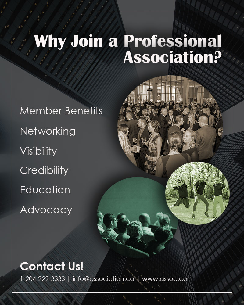
For my graphic design project, I wanted to create a generic, yet informative poster aimed at encouraging professionals to join an association. As you can see (on my draft), I didn’t identify a specific organization as I wanted to create a poster that can be used by any (or most) organizations looking to reach out to potential members. Although the design isn’t specific to a brand, I ensured that all content materials seen on the poster served a purpose in the overall design. Below you will find a comprehensive explanation of my design process and its elements.
The first step was to decide on the look and feel of the design. Associations must exert professionalism as people want to associate themselves with a reputable organization. Creating an eye-catching and sleek poster that personified professionalism was my overall goal. In the planning stages of my design, I envisioned a poster with a dark background and visible white text. In addition, I wanted to ensure that I included relevant images in which captured the attention of my target audience.
The carefully curated images on my poster are describe below…
Image 1: A large group of people networking at an event. I took this photo at one of my association’s Gala event that I had organized. We had over 700 people in attendance. I chose this photo as it showcased an environment where members of the association had an amazing time networking with other members.
Image 2: A “silly” photo of a group of men at a golf course. I took this photo at my association’s golf tournament that I had organized. This event is very popular and one that our members look forward to every summer. Members love getting the chance to strengthen business relationships with other members in a casual and fun setting.
Image 3: A photo of a seminar or presentation. This photo is by Luis Quintero on Pexels. Prospective members often want to ensure that there are educational opportunities offered by the association.
Image 4: An image called “Low-angle Photography of Buildings Covered by Fog”. A photo by Burst on Pexels – I chose this image because high rise buildings are often associated with corporate life, businesses… professionalism.
As someone who works for an association, I have gotten to know the “must-have” features in which potential members look for before joining. Most often, they look for an organization in which provides them with networking opportunities, professional development opportunities, and opportunities where they can mingle with other members in a “non-stuffy” environment. As you can see, the photos that I have chosen are deliberately aimed to reflect my target audience’s needs in hopes of catching their attention.
The text on my poster is also quite deliberate. I wanted the title to pose a question to my audience, “Why Join a Professional Association?” – this stimulates thoughts and discussions. I then give them an answer, the reasons why they should join an association – member benefits, networking, visibility, credibility, education and advocacy. Then at the bottom, a call to action – “Contact Us!” which includes a phone number, email address and website (made up examples). Providing the audience with a way to contact you keeps the flow of communication open and providing them with a website where they can learn more about your organization creates transparency.
With the contents of my poster now chosen, the next step was to carefully compose it. I chose to follow the five rules of shot composition in order to create an effective, yet visually appealing poster.
Simplicity – I concentrated on a few basic elements such as the title, text and photos, and ensured that everything is readable to my audience. The photos I chose are also relevant and clear.
Rule of Thirds – I placed my contents near points of interest in order to create a balanced composition.
Balance – I ensured that the colours on my poster are balanced. The dark background created a nice contrast to my white text. In addition, I transformed my photos into earthy tones in order to stand out slightly, but not overwhelm. You can see the deliberate placement of the text also creates a balanced distribution on the poster.
Framing– I included a thin border around my poster in order to highlight the images and text, and to drive focus on the main content.
Lines – Natural lines provides a sense of depth and perspective. I wanted to draw attention to the focal point of the poster, which was the images. The way the buildings are captured in the photo creates a natural line drawing the viewer’s attention to the carefully selected images.
By using photoshop, I was able to create different effects in order to amplify the contents in my poster. First, the high-rise buildings photo was placed as the background, then a darker, transparent layer was set over top. I then created three new layers and by using the “ellipse tool” I created three circles and arranged them in staggered positions. With the “clipping mask” I was able to clip my images to the shape. In order to mute the colours of the photos, I used “colorize” and played around with the saturation and hues until I achieved the earth tones that I was comfortable with. I then added a “drop shadow” effect to add more depth to the photos and the title text.
And there you have it folks… my first graphic design draft done on Photoshop!